Networking Solutions
.....................................................................................................................................................................................
The client wanted a logo/logotype which puts across the key word-networking. This logo was designed for 'networking solutions'- a group of students;who hold meetings, forums and discussions on ethical hacking etc, at the Anglia Ruskin University, London.They insisted to have a radical, unusual logo. The form of the logo is inspired by a continuous single strip of paper flowing through different collaterals and forming one connected identity. Moving away from a single unit for a logo, the ns logo acts as a constant - never ending logo unit portraying the ideals of the company. Its flexible form allows the logo to flow beyond one particular surface. This actually gave me a lot of freedom to experiment on different stationary.
.....................................................................................................................................................................................

final logo
.....................................................................................................................................................................................
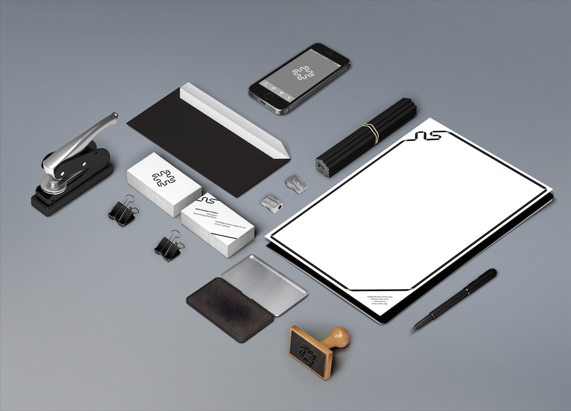
overview of stationary
.....................................................................................................................................................................................
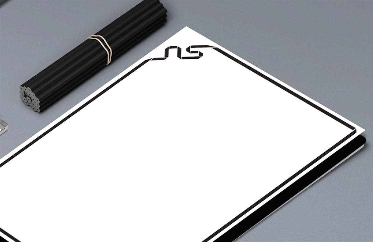
letterhead
.....................................................................................................................................................................................

visiting cards and envelope
.....................................................................................................................................................................................

rubber stamp
.....................................................................................................................................................................................

